
White Quartz Countertops: Gold, Grey or Blue Veins?
White Quartz Countertops: Gold, Grey or Blue Veins?
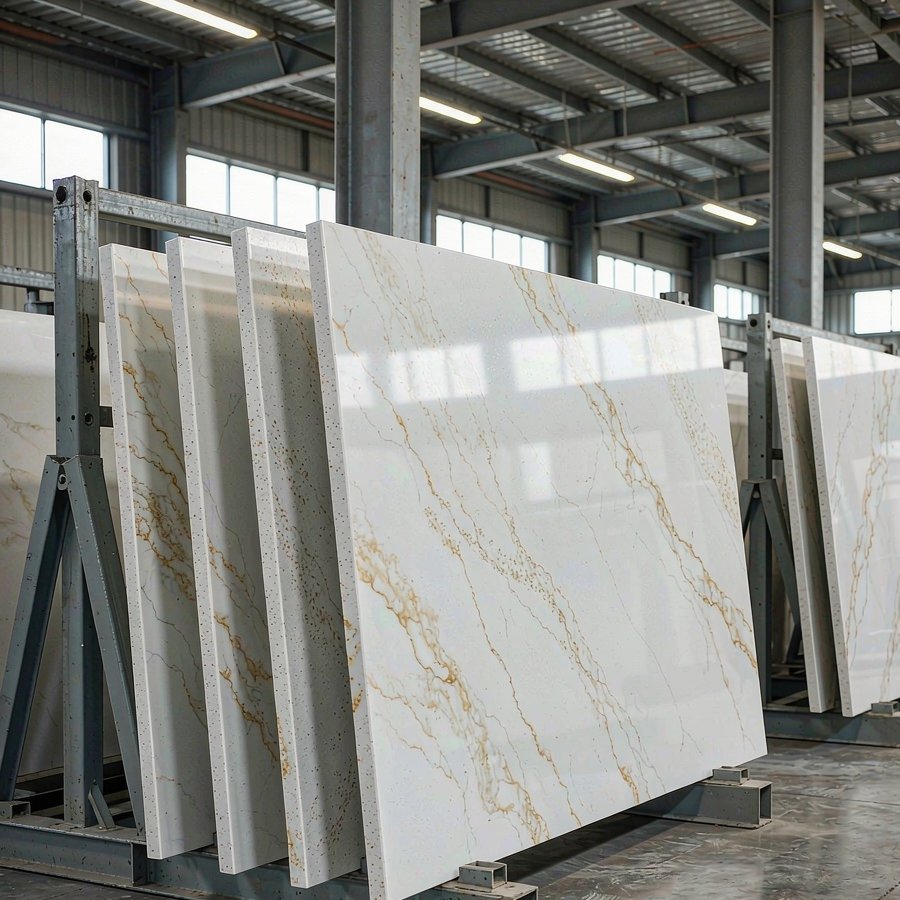
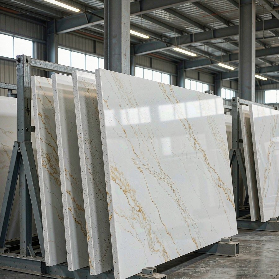
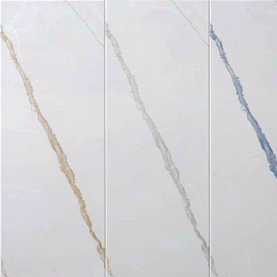
White quartz countertops are chosen for their colour and remembered for their veining. Two slabs can leave the same factory on the same pallet, both bright white, both pressed to the same specification, and still produce two entirely different kitchens once the lines running across the surface turn out to be warm gold, quiet grey or cool blue.
This guide is written for the people who have to make that call and then live with it: homeowners and designers choosing a surface, and fabricators, distributors and importers specifying one for a project. It covers how veining is produced in an engineered slab, what actually separates gold, grey and blue veins in practice, how each tone behaves against cabinetry, flooring and hardware, and what to check before an order is placed. Almost every white quartz countertops brief starts with the colour; this one starts with the vein.
Why Veining, Not Colour, Decides the Look
Colour sets the base note; veining sets the temperature, the contrast and the sense of scale in the room. A near-solid white with almost no visible pattern, a lightly veined surface you only notice at an angle, and a full-width statement line are three different rooms even when the base is identical.
Engineered white quartz countertops give you three levers that natural stone does not. The first is density — how much pattern is visible at all. The second is tone — the same pattern can be drawn in gold, grey, blue, brown or black. The third is repeatability — the design can be pressed again next season to the same specification, which is what makes a phased project possible at all. Most selection failures come from fixing the first lever and ignoring the second.
White Quartz Countertops with Gold Veins
Gold veining on white quartz countertops is the warmest and the most assertive of the three tones. A white base crossed by champagne or soft bronze lines recalls Calacatta marble, and it is the option buyers reach for when the room already contains warm timber, cream joinery or brass hardware. The shade matters more than the width: a true champagne gold lifts a space, while a vein leaning yellow or mustard starts to look dated within a season or two.
In production, a gold vein is pigment placed deliberately into the mix rather than colour mixed evenly through it. That calls for a second deposition step and tighter control of the pressing cycle, because the same pigment that forms a clean line in one sheet can smear into a soft cloud in the next. It is why gold-veined designs carry a higher inspection rate than plain whites — and why a gold vein should be judged on a full sheet rather than a small chip.
Two directions we press cover most of the demand. Marble Golden Thread is a soft white with fine pale-gold threads and low overall contrast; it reads as quiet movement rather than a statement, and it is the closest design we have to the soft gold-on-cream look buyers associate with Taj Mahal quartzite. Cloud Jade Gold Vein and Gold Vein run the other way, with a clean white base crossed by deeper bronze-gold lines and real contrast.
The practical watch-out is warmth stacking. Warm veins, warm cabinets, warm floors and warm lighting compound, and white quartz countertops that looked luxurious in a showroom can look heavy in a smaller room. Break the stack once — a cooler floor, or stainless rather than brass — and the gold reads as an accent instead of a theme.
White Quartz Countertops with Grey Veins
Grey is the default for a reason. A soft grey vein on white is the quietest of the three tones, it survives changing trends, and it sits comfortably against almost any cabinet colour. Where gold makes a claim, grey makes room — which is why it dominates modern and transitional specifications, and why it is the safest choice when a property will be sold or let rather than kept.
Grey is also the widest category of the three, and that width is what catches people out. At the pale end the veining is a cloud rather than a line: Shimmering Spring Stream is a bright white with mist-grey, drifting movement that disappears from across a room and reappears as you walk past it. At the darker end, a charcoal or graphite vein turns the same base into a high-contrast surface that behaves much more like a statement stone. Both are legitimate ways to specify white quartz countertops; they are simply not interchangeable in a design.
Because grey is neutral in temperature, it is the tone that gives you the most freedom elsewhere. Warm oak, cool concrete-look tile, brushed nickel and matte black all sit next to white quartz countertops with grey veins without fighting them, which is not equally true of the other two tones.
White Quartz Countertops with Blue Veins
Blue is the coolest and most architectural of the three, and it is not for every room. Where a grey vein whispers and a gold vein glows, a blue vein draws a line and expects you to follow it. In the right space — good daylight, cool cabinetry, an uncluttered layout — white quartz countertops with blue veins are the most distinctive surface in the range.
The constraint is light. Blue reflects cool, and a dim or north-facing kitchen with no warm detail will simply look cold. Buyers who want the look without the risk usually keep the blue to one element: a full-height backsplash, an island, or a bathroom vanity, with plain white on the working surfaces. A cool accent vein against a clean white body, as in Lapis Azure Glaze, delivers the effect without turning the whole kitchen blue.
Be precise about what a blue vein is. Engineered slabs read as blue through a grey-blue or slate-blue line, not a saturated primary blue; anything closer to ink will read as black at normal viewing distance. Where a project needs genuinely dark contrast on white, a black vein is the more controllable route — White Realm Black Mark is a white base with black flowing lines, and it behaves predictably under any lighting.
Gold, Grey or Blue: A Comparison
Read the table as a starting point for a sample request, not as a substitute for one. White quartz countertops from two suppliers can behave differently from the same design name, and the only honest test is a large sample in the room it is going into.
What Veining Says About the Slab
Vein pattern is one of the few visible signals of how a slab was actually made, and it is worth reading before price becomes the only topic.
A vein is a pattern, not a sparkle. A surface decorated with glitter, metallic flakes or crystal speckle is a different product, and usually a cheaper one — the sparkle distracts from a flat, uniform base. Genuine veining is drawn through the slab in three dimensions and continues across the thickness, so the pattern on the face still makes sense where the sheet is cut and the edge is polished.
Continuity is the test of quality. On white quartz countertops a bold vein should run without breaking up or ghosting out across the sheet. Veins that start and stop, or blur halfway across, usually point to an unstable press cycle rather than a design decision — and they are exactly the defects that make white quartz countertops look inconsistent from one room to the next.
Shade control is the test of a factory. On a single slab almost everything looks acceptable; the question is whether the fifth pallet matches the first. Colour difference between batches is the most common complaint in bulk orders, and controlling it is a matter of batching and inspection discipline rather than luck — the process is set out in our notes on controlling colour difference in bulk quartz orders.
Brightness is a cost, not a preference. A whiter base requires a cleaner, higher-whiteness aggregate. The whiteness of the finished slab follows the whiteness of the input, and the difference between a stock white and a high-whiteness white is visible the moment two white quartz countertops stand side by side.
Matching the Vein to Cabinets, Floors and Hardware
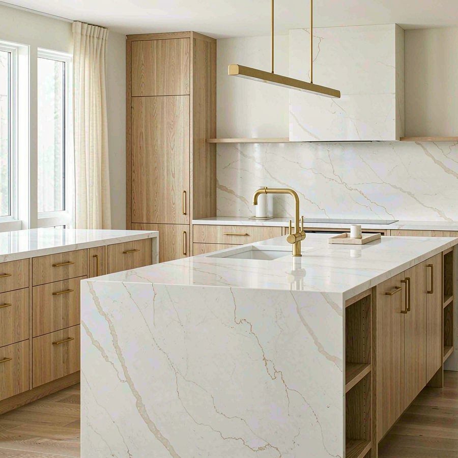
Match the temperature, contrast the value. On white quartz countertops, warm veins want warm surroundings and cool veins want cool ones; the contrast should come from lightness rather than temperature. A champagne vein against cream cabinets and light oak flooring is coherent. The same vein against grey tiles and chrome is not.
Let one element carry the movement. A heavily veined surface is already the loudest thing in the room. If the white quartz countertops are bold, keep the backsplash plain and the cabinet fronts flat. A dramatic vein, a mosaic splashback and a busy floor compete rather than compose.
Choose hardware that supports, not repeats. Brass next to a gold vein is a continuation, which can be elegant or monotonous; matte black is a deliberate break. Grey veins take brushed nickel and stainless easily because they are already in the same family.
Two details get decided too late. Where the vein runs matters as much as its colour — a line crossing a sink cut-out at an angle reads differently from one running parallel to the cabinet line, and on a long run the pattern direction should be agreed with the fabricator before the slabs are cut. And flooring sets the base of the whole scheme: white quartz countertops over a busy wood grain is a harder combination to carry than either element alone.
Polished or Honed: How Finish Changes the Veining
A polished surface is the volume default and the finish that flatters veining most. The reflective gloss deepens the contrast between the white base and the vein, moves with the light, and hides minor variation underneath. It is also the finish that shows smudges and water marks most readily, which matters more on a dark vein than a light one. Our measurement method for this finish is set out in the notes on glossiness standards for polished quartz countertops.
A honed or matte finish does the opposite. Without the gloss, the vein sits flatter and quieter, the surface reads closer to natural stone or concrete, and light fingerprints are less obvious. The trade-off is that the surface has nowhere to hide: colour variation and vein quality are more exposed, which is one reason matte white quartz countertops should be judged on a full sheet in daylight rather than a sample under showroom lighting.
The two finishes also change how a room photographs, which matters on projects with a marketing or handover pack. Polished white quartz countertops read brighter and more formal in images; honed surfaces read softer and more contemporary. Neither is more durable in normal use — with a Mohs hardness around 6, both resist everyday scratching but neither is scratch-proof, and both should be protected from hot pans and knives.
Specifying White Quartz Countertops for Trade Work
On a single kitchen the risks are aesthetic. On a project they are logistical, and the specification has to be written accordingly.
Fix the batch before the order, not after. For a hotel, a residential development or a phased fit-out, ask whether the whole quantity can be pressed in one campaign. Matching a later batch to an earlier one is possible within a stated shade range, but it is never as close as pressing everything together.
Approve on a large sample. A 100 mm chip cannot show vein direction, density, or how the pattern behaves across a three-metre run. Ask for a full-sheet image or a cut sample showing several vein lines, and view it where the white quartz countertops will actually be installed. This matters most at the two extremes — the boldest and the quietest designs look most different between a small sample and an installed run.
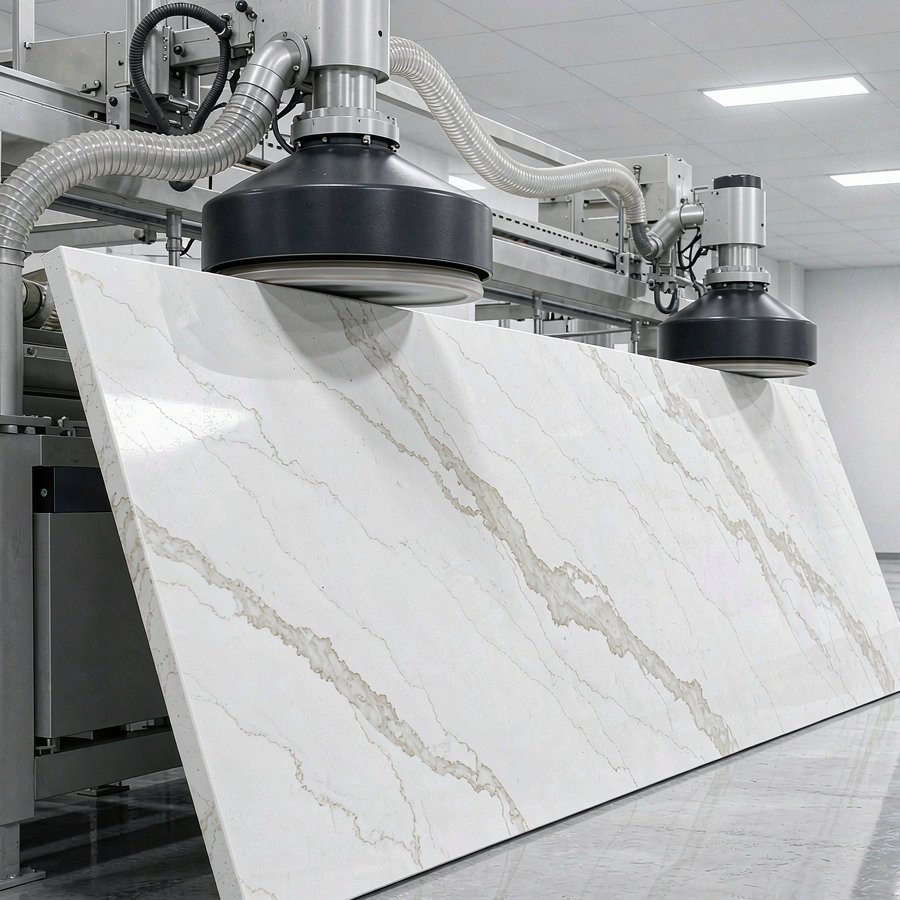
Set the format and thickness in writing. We press 3200 × 1800 mm, 3200 × 1600 mm and 3200 × 750 mm as standard, with an oversized 1800 × 3500 mm format for full-height and large-island work, at 18 mm and 20 mm. A 3200 × 1800 mm sheet weighs 248.8 kg at 18 mm and 276.4 kg at 20 mm, and that weight is what fixes the loading plan, so the format decision and the freight decision are the same decision. The full range is set out in our guide to quartz slab sizes and jumbo formats.
Agree the vein direction on a layout. Supply the fabricator with a nesting plan showing which way the pattern runs on each piece, and check it against how the veins were laid on the approved sheet. This is the most common cause of an argument on delivery day — and the usual reason two rooms of white quartz countertops look like two different stones.
Confirm the commercial terms early. Format, quantity, trade term and delivery port are the four items that turn a colour conversation into a real quotation; the wider process of sampling, inspection, payment and lead time is covered in our guide to buying quartz slabs from China.
Common Mistakes When Choosing a Veined White Slab
Choosing from a phone screen. Cameras and displays shift white balance by a wide margin, and a video call makes it worse. The same slab can look cream on one device and blue-white on another. Only a physical sample is evidence.
Judging a bold design on a small chip. On a highly veined slab a small cut sample is not a miniature of the whole sheet — it is a random window onto it. The design may look calm on the chip and dramatic across the run, or the reverse.
Asking for sparkle when you mean movement. Buyers who want a surface to "catch the light" are usually reacting to a flat, uniform base and actually want veining. Metallised flake and glitter are a different specification, and a cheaper one.
Ordering the exact quantity. Off-cuts, joint positions and a later phase almost always consume more than the drawing shows. A small buffer of the same batch costs less than a mismatched top-up, and on white quartz countertops a mismatched top-up is more visible than on a dark surface.
Comparing with natural marble on price alone. Marble is a quarried material priced on block quality and pattern; an engineered slab is priced on a repeatable production cost. The performance difference is real — engineered quartz is not heat-proof — but where consistency across a large project matters, the engineered surface is the more predictable purchase.
Frequently Asked Questions
Which veining is better, gold or grey?
Neither is intrinsically better; they set different temperatures. Gold warms a room and suits timber, cream and brass. Grey is neutral and suits almost anything, which makes it safer for a property that will be sold or let. Blue is the most distinctive and the most dependent on natural light. Decide the warmth you want first, then pick the vein tone that delivers it.
Do white quartz countertops with gold veins look dated?
Not in themselves — the risk is in the shade rather than the concept. Champagne or soft bronze stays current; a vein leaning strongly yellow or mustard dates quickly. Ask for a full sheet under neutral light rather than judging from an online photo, where the whites are rarely accurate.
Is a blue-veined slab hard to match with cabinets?
It constrains the palette more than the other two tones, but it is not difficult. Cool greys, charcoal and stainless steel are natural partners, and the safest approach is to keep the blue to one element — an island, a vanity or a full-height splashback — with plain white quartz countertops on the working surfaces.
Are veined white slabs harder to keep clean?
White quartz countertops show staining more than a dark surface, but veining is forgiving in a different way: a fine pattern breaks up the eye's read of dust, crumbs and water marks better than uniform white. Clean with water and a mild neutral detergent, and wipe up oil, wine and strong pigments without leaving them to sit.
Can I choose a veined design from a small sample?
For a quiet clouded design such as Shimmering Spring Stream a large sample is usually enough. For bold, high-contrast designs it is not, because the character of the surface is in how the veins run across the sheet. Ask for a full-sheet photograph or a cut sample showing several vein lines.
How do I keep veining consistent across a large project?
Fix design, format and thickness for white quartz countertops in one specification, press the quantity in a single campaign where possible, approve a large reference sample and keep it on file, and agree the vein direction on a cutting layout before processing. Those four steps remove most of the risk on phased or multi-room work.
Conclusion
White quartz countertops are not a neutral choice; they are a surface that will be looked at every day for the life of the kitchen. The colour sets the room, but the veining sets the character — warm and assertive in gold, quiet and adaptable in grey, cool and architectural in blue. Fix that decision first, then let format, finish and budget follow it, and the rest of the specification becomes straightforward.
We press and finish engineered quartz slabs in-house for homeowners, designers, fabricators, distributors and project buyers — 3200 × 1600 mm standard, 3200 × 1800 mm jumbo and 1800 × 3500 mm oversized formats at 18 mm and 20 mm, across a veined white range that runs from Marble Golden Thread to bold Calacatta-style and dark statement designs. All of it is produced under ISO 9001, with NSF food-contact and SGS environmental and fire certification, and standard orders ship in two to four weeks.
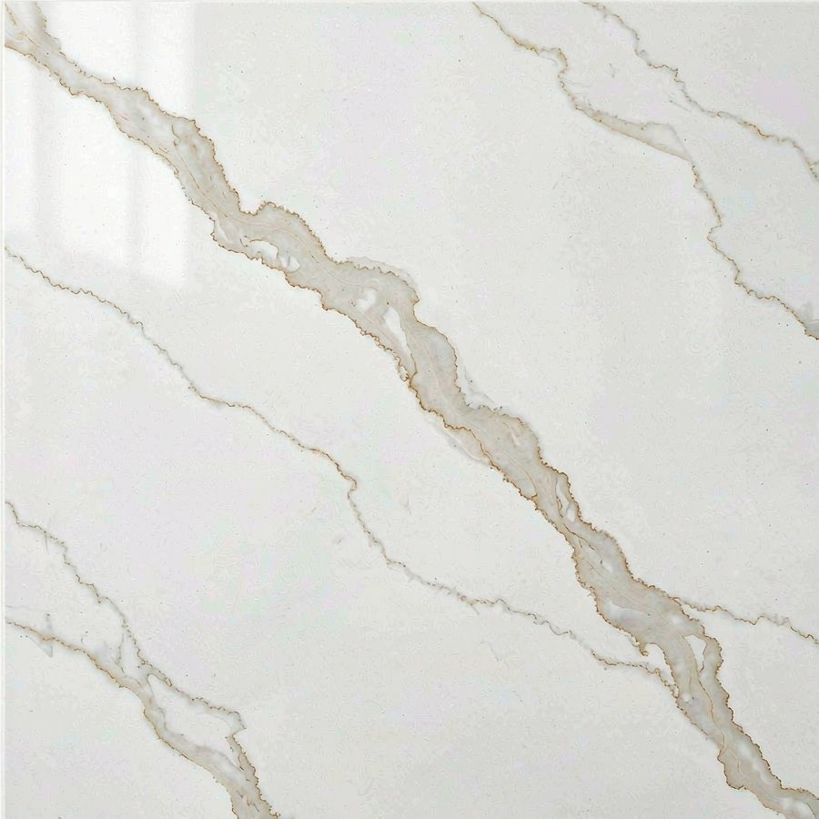
And for the most searched marble name of them all: our guide to Calacatta quartz covers how the bold white-and-gold look is engineered, the vein styles in production, real slab sizes, and the cost drivers behind the premium.
Two classic Italian marble looks sit in this family too — our carrara and arabescato quartz guide explains how they differ from the gold and grey veins above.
Curious which veins buyers are choosing right now? Our most popular quartz colors in 2026 guide ranks the palette.
Related Articles
- Best Quartz Colours for Modern Kitchen Projects
- Quartz That Looks Like Taj Mahal: Quartzite Alternatives
- Quartz vs Marble: Which Is Better for Kitchen Countertops
- Quartz Slab Price Per Square Foot: What Actually Drives It
Matching a Vein Direction for Your Project?
Send us the tone you are working towards — champagne gold, quiet grey or a cool blue accent — together with the format, thickness and approximate quantity. We will match it against a current design, share full-sheet images rather than chips, send the technical data sheet and current certificates, and confirm availability for your project. Trade and project buyers are welcome to ask for an indicative white quartz countertops quotation, priced per sheet at a stated format and thickness so the number can be compared like for like.
📱 WhatsApp: +86 198 6115 3736
📧 Email: raykelee@hyquartzslabfactory.com
Send Us A Message