
Best Quartz Colors for Modern Kitchen Projects
Best Quartz Colors for Modern Kitchen Projects
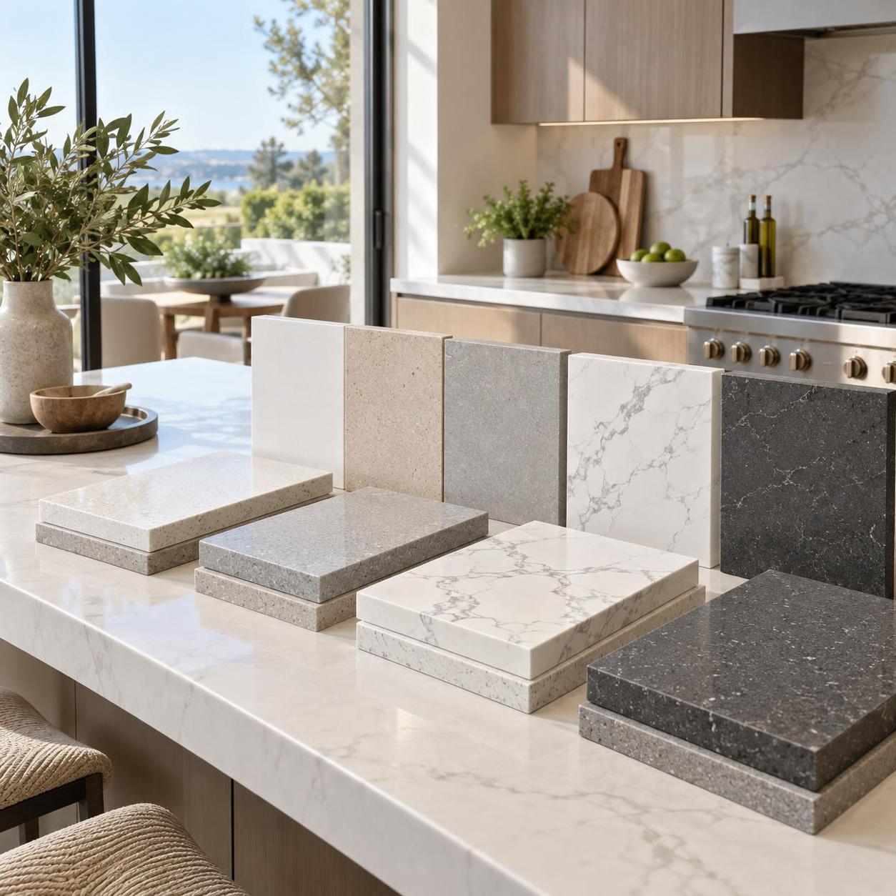
Best Quartz Colors for Modern Kitchen Projects: How to Choose
When people search for the best quartz colors for modern kitchen projects, they are rarely looking for a simple list of attractive shades. What they usually need is a way to narrow choices without creating problems later: a color that fits the design direction, works with cabinet and flooring decisions, looks believable under real lighting, and still performs well in everyday use. In project terms, color is not a decorative afterthought. It affects specification approval, buyer confidence, perceived cleanliness, resale positioning, and even how forgiving the finished kitchen will be after handover.
Quartz remains one of the most practical countertop materials for modern kitchens because it sits at the intersection of visual consistency, durability, and low maintenance. But “best” depends heavily on project type. A developer furnishing multiple units, a custom home builder, an interior designer, and a distributor stocking slabs for local fabricators will not define the right color in the same way. The most successful selections usually balance three factors at once: market acceptance, install risk, and long-term visual stability.
What modern kitchens are really asking from quartz color
In current kitchen design, modern does not necessarily mean stark white or high-contrast black. It usually means cleaner visual lines, more integrated finishes, and surfaces that support a controlled material palette. That is why the strongest quartz colors today tend to fall into a few repeatable groups: soft whites, layered warm neutrals, calm grays, restrained marble-look veining, and selected dark tones used with discipline.
From a materials perspective, the question is not only “Which color looks modern?” but also “Which color will still look resolved after cabinets, backsplash, hardware, appliances, and lighting are all installed?” That is where many color choices succeed or fail.
1. Crisp white: still the volume leader, but not always the safest default
Pure and bright white quartz remains one of the most specified options in contemporary kitchens. It works especially well in compact spaces, speculative residential builds, and projects where a clean, reflective surface helps amplify light. For many builders and dealers, white is the easiest color to sell because it is broadly familiar and visually low-risk at the showroom stage.
But there is a practical caveat. The cleaner and brighter the white, the more sensitive it becomes to context. Under cool LEDs, it can read clinical. Next to warm white cabinets, it may look unexpectedly blue. In kitchens with heavy daily use, some buyers also find ultra-clean white less forgiving because crumbs, sauce stains, and surface clutter remain visually obvious.
For projects aiming at broad market appeal, soft white often outperforms absolute white.
2. Soft white and off-white: the most reliable all-round choice
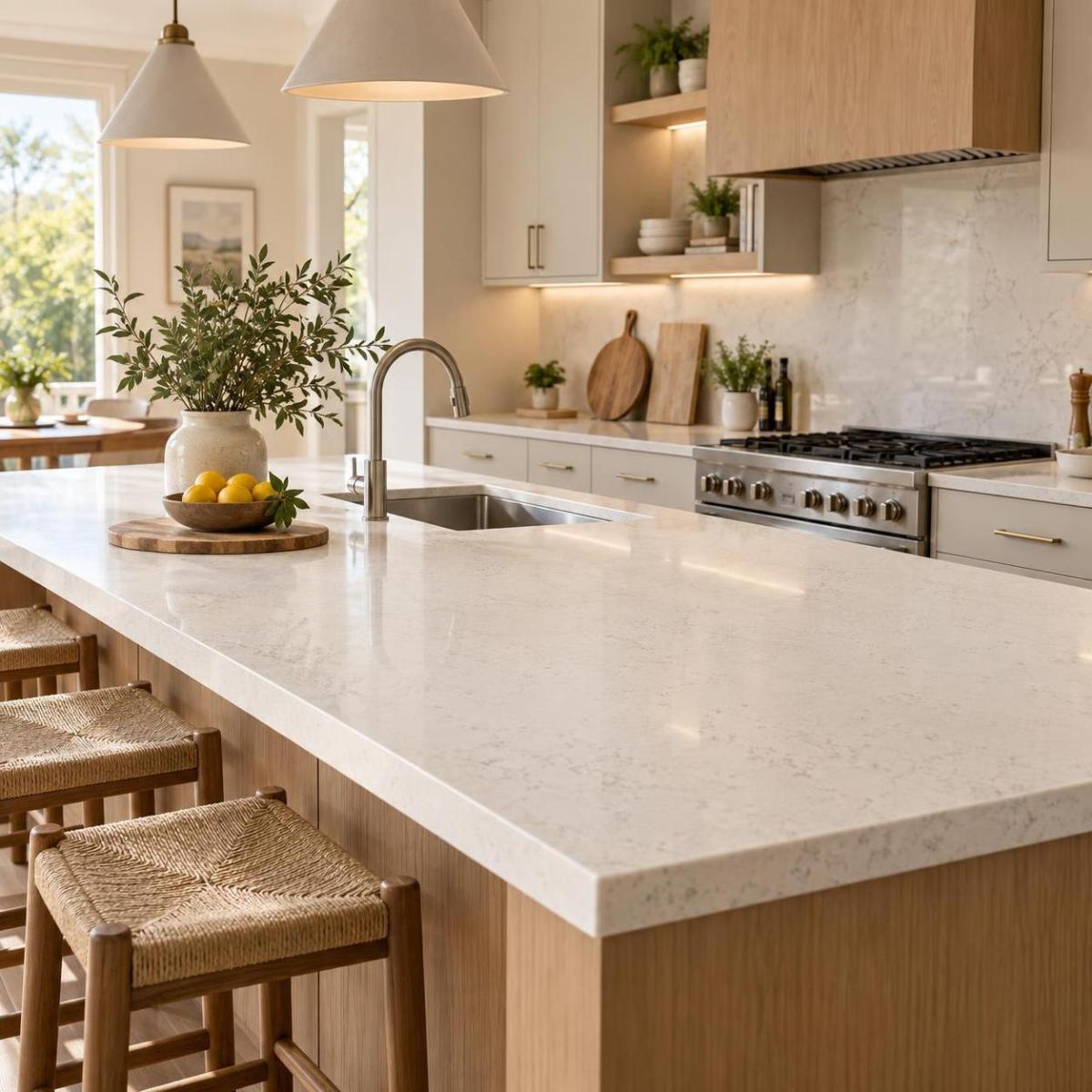
If the goal is to create a modern kitchen without making the space feel cold, soft white and off-white quartz are usually the strongest candidates. These colors work well with wood veneers, matte lacquer cabinets, brushed metal hardware, and warmer flooring palettes that have become common in current residential interiors.
From a B2B selection standpoint, off-white also reduces coordination risk. It can absorb small tonal differences between cabinet batches, backsplash tiles, and paint finishes more gracefully than a high-purity white slab. That matters in multi-trade environments where the final kitchen rarely matches the original mood board exactly.
For distributors and fabricators, this category often has another advantage: fewer disputes over “wrong undertone” after installation, provided samples were reviewed under actual project lighting.
3. Warm beige and greige: modern, but only when the tone is controlled
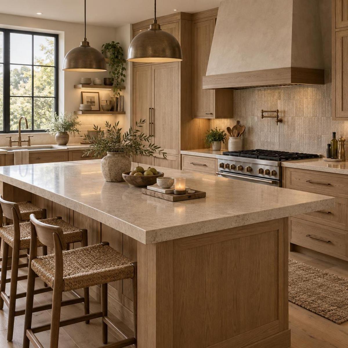
Beige has returned, but in a different form from earlier decorative trends. In modern kitchens, the successful versions are muted, mineral, and restrained. Think warm greige, mushroom, oat, sand-gray, or taupe-leaning neutrals rather than yellow-heavy cream.
These tones are particularly effective in projects trying to avoid the black-white-gray formula that many buyers now see as overused. They pair naturally with oak, walnut-look laminates, bronze accents, and textured porcelain backsplashes. In upscale residential work, warm neutral quartz can make a kitchen feel more architectural and less showroom-generic.
The risk is undertone drift. Some beige slabs look elegant in isolation but turn pink, yellow, or muddy once placed beside cabinetry and flooring. This is one of the categories where a small hand sample is often insufficient. Decision-makers should review a larger piece or full slab when possible.
4. Light gray: useful for transitional modern schemes
Light gray quartz remains relevant, especially in urban apartments, mixed-use residential projects, and kitchens that need a neutral bridge between cool and warm finishes. It can help soften all-white kitchens and gives a slightly more dimensional look without relying on bold movement or pattern.
That said, gray is no longer the automatic modern answer it was several years ago. In some markets, especially where warmer interiors are gaining traction, flat cool gray can make a kitchen feel dated faster than expected. The better-performing options today are usually grays with subtle warmth or fine particulate texture rather than cold, uniform concrete-like tones.
5. Marble-look white with gray veining: premium feel, but specification discipline matters
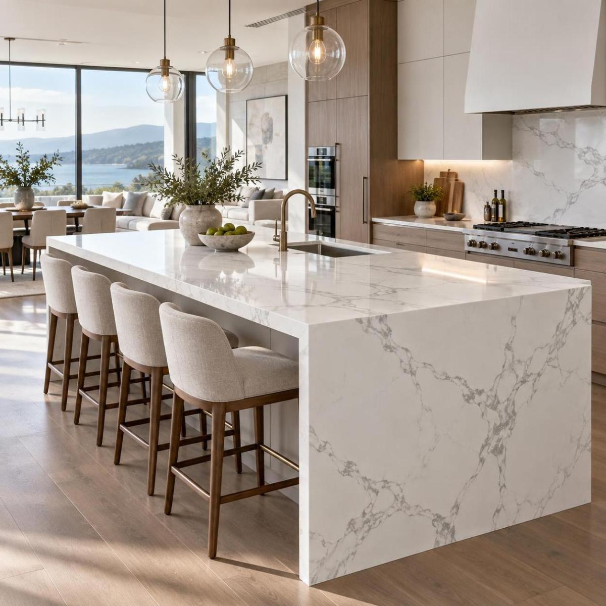
For many modern kitchen projects, the most attractive quartz color is not a solid color at all but a white base with controlled veining. This category has strong appeal because it gives the visual language of marble with lower maintenance expectations and more predictable supply.
It works well in custom homes, premium multifamily units, and design-led renovations where the kitchen needs a focal surface without becoming visually heavy. Veined quartz can also help a project look more expensive than a plain slab at similar layout scale.
Still, this category requires more coordination than many buyers expect. Vein direction, pattern repeat, slab-to-slab variation, seam planning, and waterfall edge alignment all matter. A slab that looks refined on a sample board can appear artificial when the veining is too repetitive or too high-contrast across a full island run. This is not only a design issue; it affects fabrication planning and waste percentage as well.
6. Warm-veined quartz: a better fit for today’s wood-forward kitchens
As kitchens move away from icy palettes, quartz with soft taupe, beige, or warm gray veining has become more relevant. These options often work better than classic cool-gray veining when paired with natural wood cabinetry, cream wall colors, or warmer metal finishes.
For developers and designers trying to future-proof a project, warm-veined quartz can be a stronger middle ground than stark marble-look patterns. It feels contemporary without leaning too hard into a trend cycle that may cool quickly.
The key is moderation. If the background tone is too creamy or the veins too brown, the surface can lose the crispness most buyers still associate with a modern kitchen.
7. Charcoal and black: strong visual impact, narrower application window
Dark quartz countertops can look exceptionally sharp in modern kitchens, particularly when used with light oak cabinets, handleless systems, integrated appliances, or dramatic architectural lighting. Charcoal often performs better than true black because it retains depth without showing every fingerprint, dust trace, or water spot as aggressively.
These colors are generally better suited to larger kitchens with good daylight or well-planned task lighting. In smaller or poorly lit spaces, dark countertops can visually compress the room and make the composition feel heavy. This is one of the clearest cases where a color may photograph well but underperform in daily use.
For mainstream residential projects, black quartz is usually a targeted design move rather than the safest broad-market selection.
8. Concrete-inspired and industrial neutrals: useful, but easy to overstate
Concrete-look quartz has appeal in modern and semi-industrial kitchens, especially in loft conversions, hospitality-style residences, or projects that combine metal, glass, and textured finishes. It offers the urban look many clients want while avoiding some of the sealing and porosity concerns associated with actual concrete surfaces.
However, this is a category where marketing language often runs ahead of real-world fit. Concrete-look surfaces can feel sophisticated in a curated presentation, but if the rest of the kitchen is not equally disciplined, they may read flat or unfinished rather than refined. They also tend to be more style-specific, which may reduce flexibility for resale or later design updates.
A practical way to compare quartz colors before approval
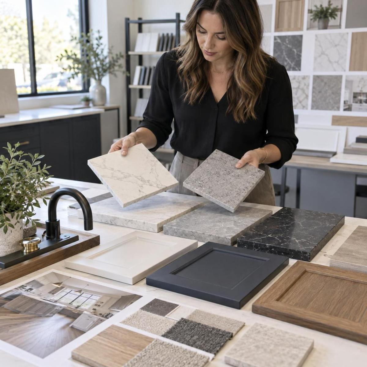
Color selection becomes easier when decision-makers stop comparing slabs in isolation and start judging them in the context of the whole kitchen. A useful screening framework looks like this:
Claims that sound true, but need context
One common assumption is that lighter quartz is always easier to live with. In practice, light colors usually make dust and scratches less obvious, but they can highlight food stains and visual clutter more quickly. Another assumption is that veined quartz automatically looks more premium. Sometimes it does, but poorly scaled or repetitive veining can have the opposite effect.
There is also a tendency to treat quartz color as a purely aesthetic choice. In real projects, it influences yield, seam planning, inventory strategy, approval cycles, and claim risk. A fabricator may prefer one color for clean processing and dependable results, while a developer may prefer another because it reduces buyer hesitation in show units. Both are valid, but they are not the same decision.
What buyers, specifiers, and suppliers should watch next
Several shifts are worth tracking. First, warmer neutrals are clearly stronger than they were a few years ago, especially in projects moving away from cold monochrome kitchens. Second, marble-look quartz is still in demand, but buyers are becoming more selective about realism and scale. Third, plain solids remain commercially important, yet the strongest performers are increasingly those with subtle depth rather than perfectly flat color.
Supply-side consistency also deserves attention. Depending on manufacturer and region, the same named color family may vary in brightness, particle distribution, or vein expression between production runs. For larger developments or repeat programs, approval should be tied to the actual production batch or at least to current slab photography and sample controls.
If the project needs the safest modern answer, soft white, warm off-white, and restrained warm-veined quartz remain the most dependable choices. If the goal is differentiation, charcoal, concrete-inspired neutrals, or bolder marble looks can work well, but only when the full kitchen composition is carrying the same design logic. The best quartz color is usually the one that still looks intentional after fabrication, lighting, and daily life have had their say.
If you are selecting colours for a commercial or high-end residential project, Commercial Quartz for Shopping Mall and Front Desk Counter and the Villa Quartz Slab Selection Guide for High-End Interiors both cover how tone and veining behave at scale. When a client asks for a colour by name rather than by category, our guide to quartz that looks like Taj Mahal breaks those warm cream and ivory tones down slab by slab.
Colour choice is only half of the decision: the vein tone is what carries it into the room. Our guide to white quartz countertops with gold, grey or blue veining compares the three tones side by side and sets out how each pairs with cabinetry, flooring and hardware.
Statuario quartz is one of the fastest-rising white looks in spec work — our statuario quartz guide covers vein styles, slab sizes and finishes.
To see how these choices rank this year, read our roundup of the most popular quartz colors in 2026.
Related Articles
- How We Control Color Difference in Bulk Quartz Orders
- Quartz vs Marble: Which Is Better for Kitchen Countertops?
- Maintenance Guide for Quartz Countertops
- Glossiness Standard of Polished Quartz Countertops
Source Modern Quartz Colors From a Batch-Controlled Manufacturer
From soft whites and warm neutrals to controlled marble-look veining and statement dark tones, we supply engineered quartz slabs with stable color across production batches, full-slab references, and reliable repeat-order matching for residential, hospitality, and multi-unit projects. Contact us for color cards, samples, and project pricing.
📱 WhatsApp: +86 198 6115 3736
📧 Email: raykelee@hyquartzslabfactory.com
Send Us A Message